Pier Law & Mediation
Branding | Print Design
Recently I spent some time in the offices of Pier Law and Mediation (PLM) working on several branding projects, including creating an official Brand Standards package. Although they had a logotype/word mark, a logo mark and brand colours, there was no official documentation to support the brand.
After doing an audit of the website, business cards, letterhead and other pre-established marketing deliverables, I spoke with the Owner/Principal Lawyer and talked with her about her vision for the brand and the firm, we discussed the mission and the values that fuel the firm and all decisions relating to the firm.
PLM is a team of exceptionally knowledgeable individuals that have a strong work ethic and that are highly skilled in what they do. Their mission is to assist and empower their clients and families to navigate what is arguably one of the most difficult times in their lives. They recognize that no two divorces are the same and need to be treated as such.
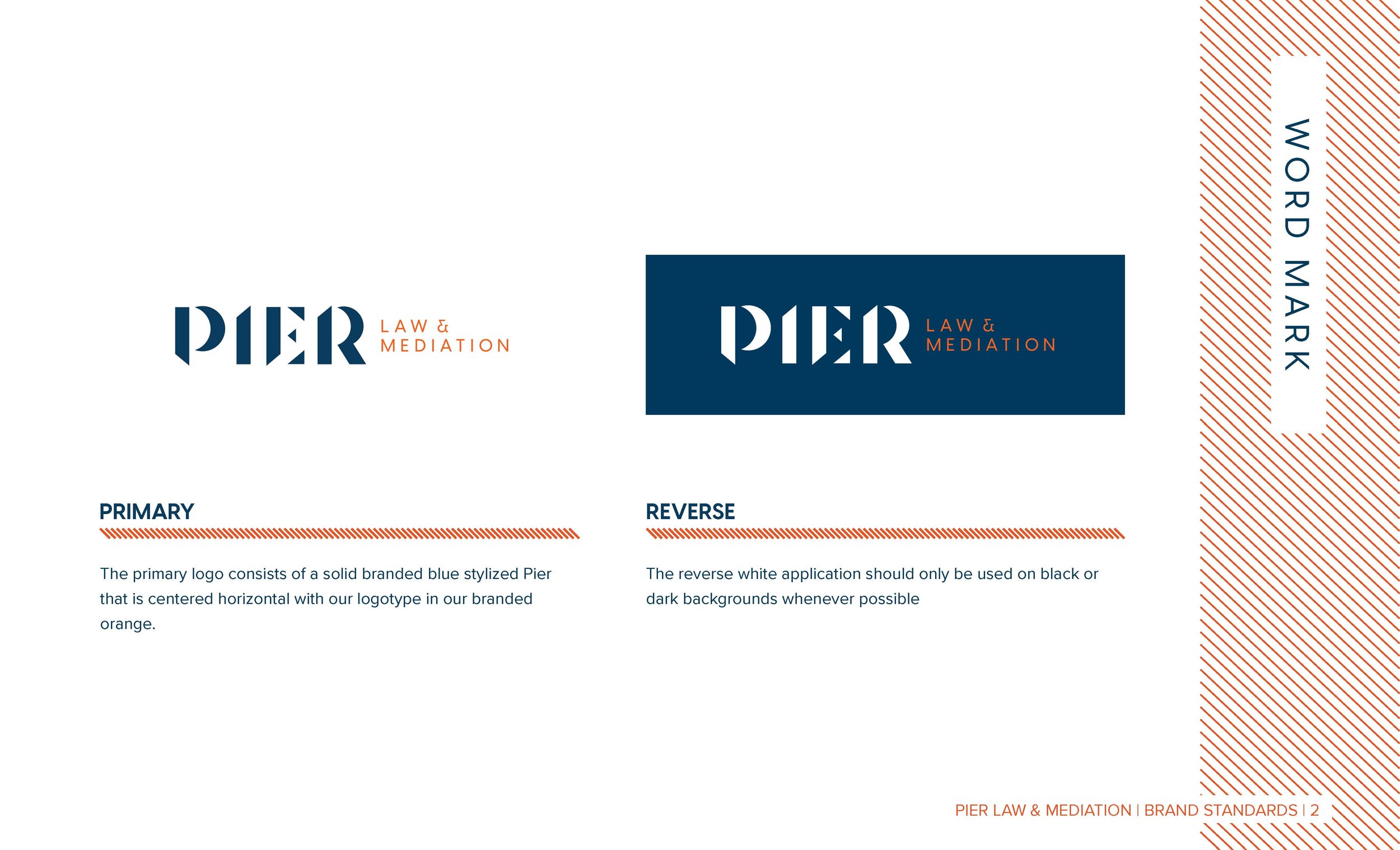
As the word mark was starting to gain recognition since the firm's establishment in 2019, I chose not to modify it. However, I noticed some variations in use, so it was essential to establish a single primary word mark.
After establishing the primary word mark, I worked on refreshing the logo mark to give it a more modern look. Having a solid “P” in combination with starburst lines that have more weight to them and rounded ends makes it look less aggressive and more approachable.
The next step was to create an official colour palette, fonts, supporting graphics, tone, photography styles, and logo treatment to strengthen the brand's identity.


